Scaling a learning platform for optimal user-experience
THE PROBLEM
OffSec's learning library platform had fallen behind the quality of the content it housed. The user experience felt dated and disconnected, creating a gap between the premium value of the learning content and the environment learners were navigating. For a platform where access does not come cheap, that disconnect was a liability.
MY ROLE
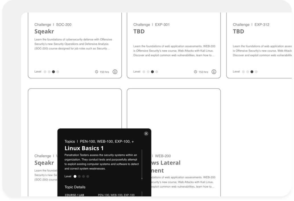
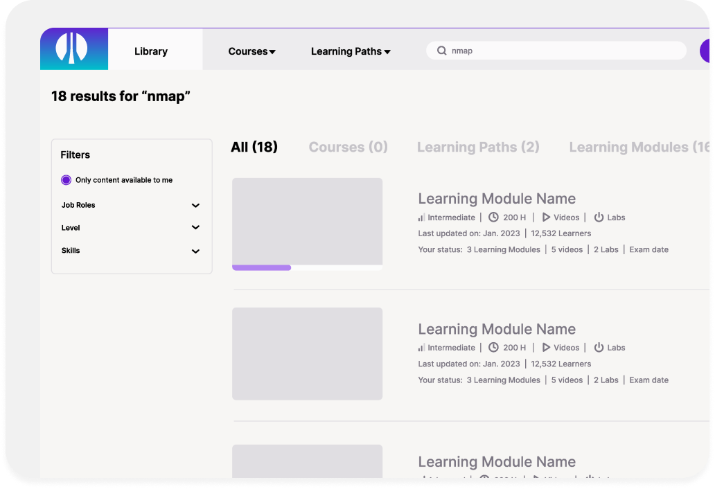
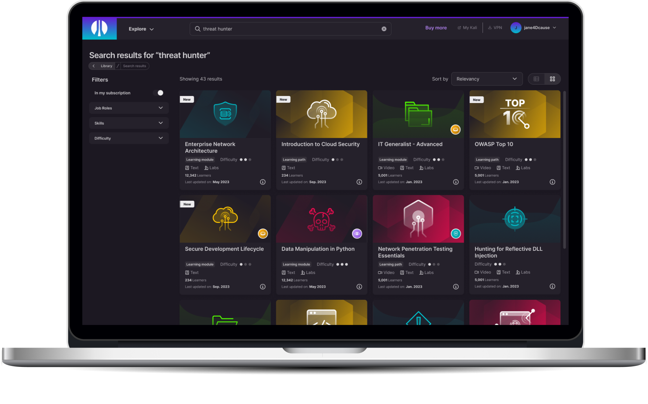
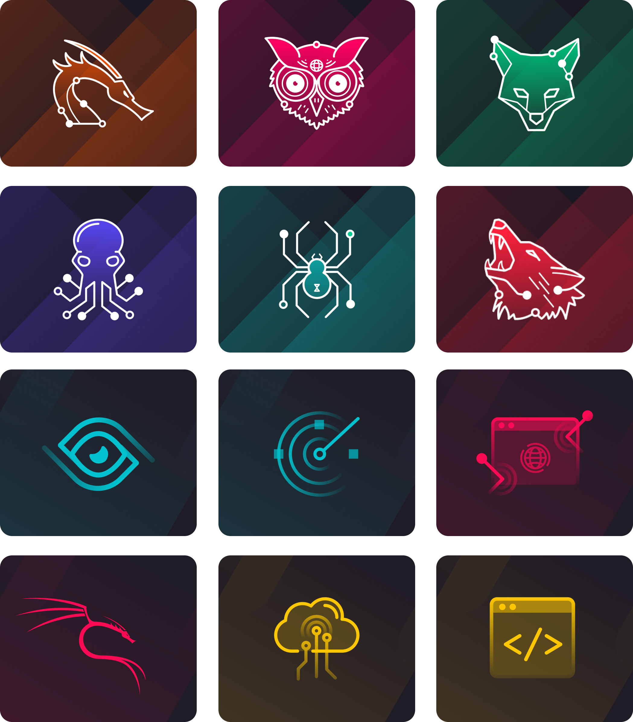
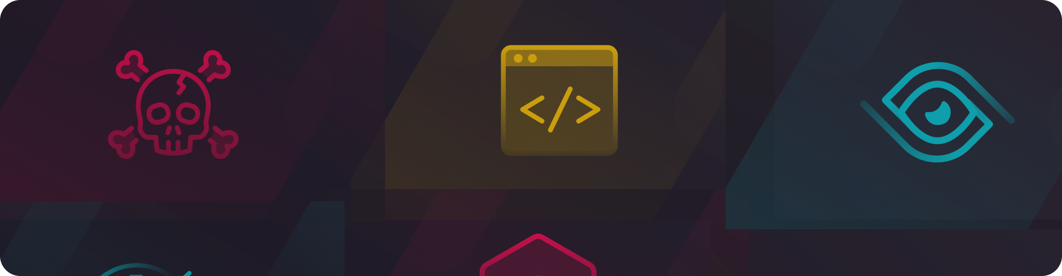
I collaborated with the CEO, Head of Product, and Lead UI/UX Designer to shape the platform's design direction. I contributed to the overall UI/UX, led creative direction, developed custom graphics, and built out the visual framework for categorizing learning topics at scale, ensuring learners could navigate a deep content library intuitively and consistently.
THE TAKEAWAY
The updated platform brought the user experience in line with the caliber of content OffSec is known for. Learner engagement improved across key interactions, including 30% increase in content discovery and 25% improvement in session depth. The project was a strong reminder that premium positioning has to be felt at every layer of the product and not just in the content itself. Building a visual categorization system at this scale also pushed me to think more rigorously about scalability and consistency across a complex information architecture.
THE WORK