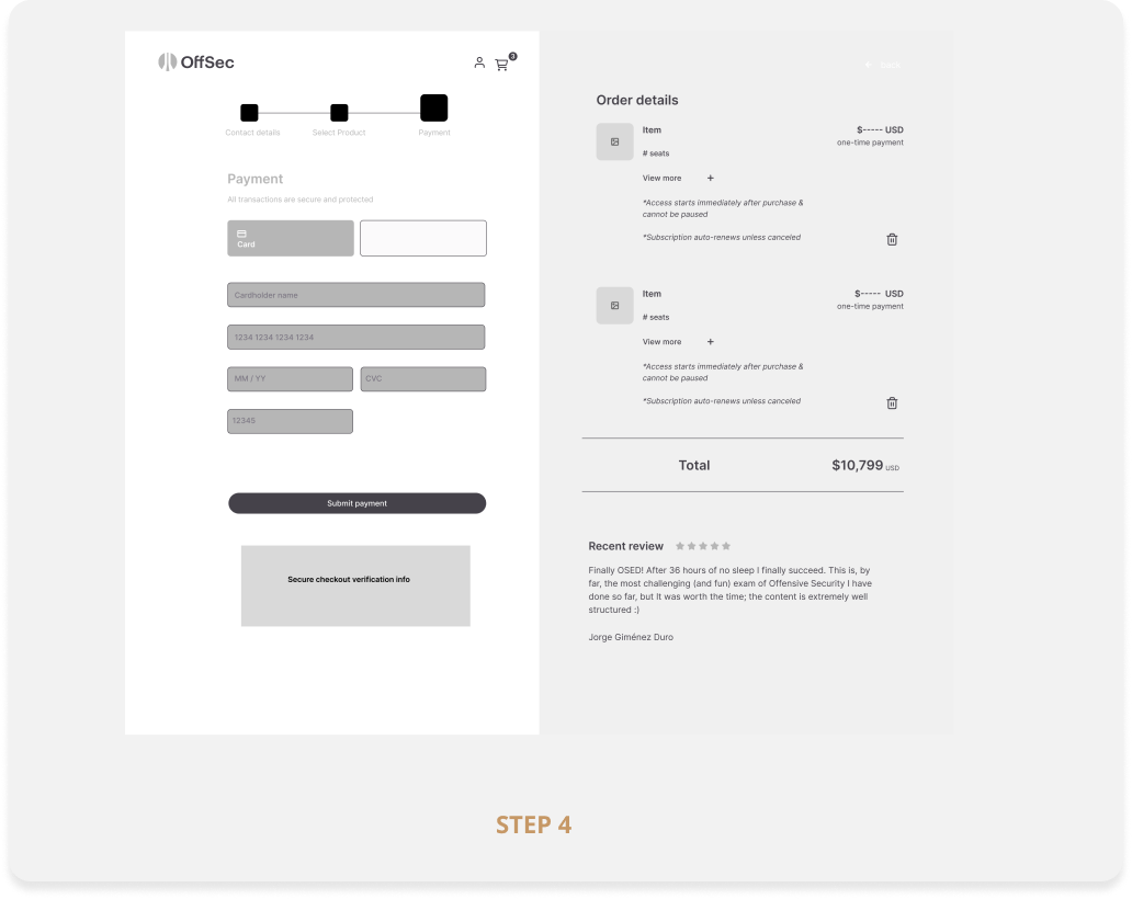
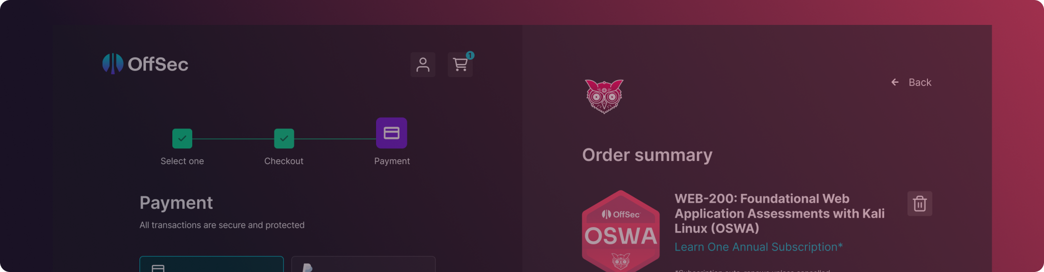
Creating a better checkout experience for the user
THE PROBLEM
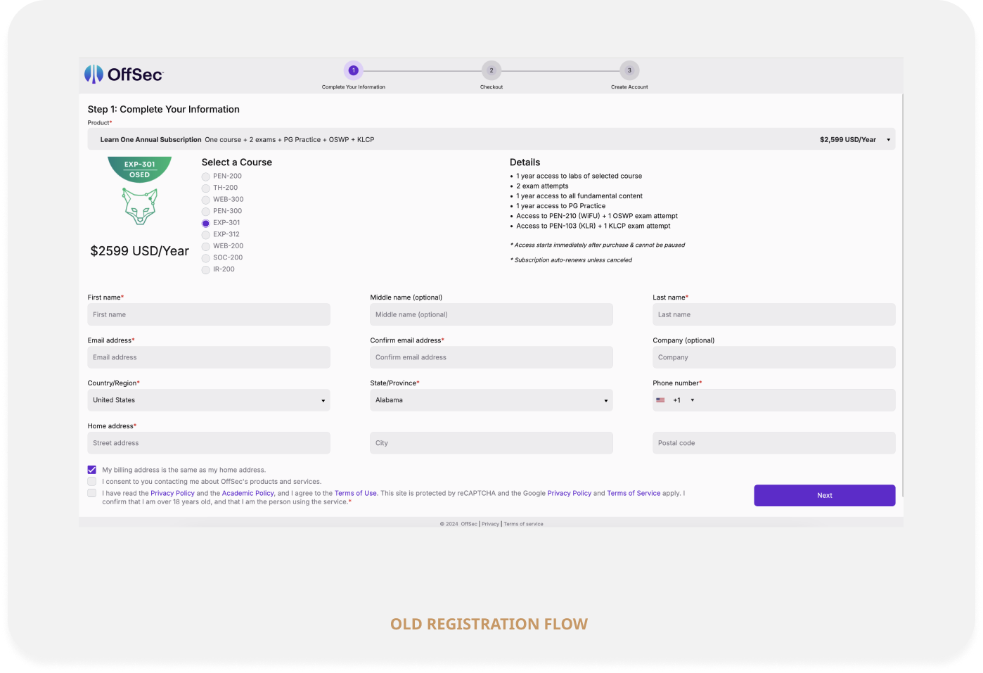
The legacy checkout flow for purchasing an OffSec course was dated and misaligned with the newly revamped website. Abandoned carts were a growing business concern, and while overall performance was holding steady, we recognized that was largely carried by OffSec's brand reputation rather than the experience itself. We knew a more intentional purchasing flow could directly address drop off, improve conversions, and better reflect the quality of what customers were buying into.
MY ROLE
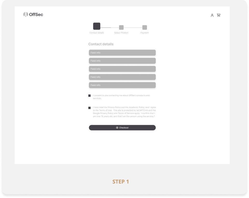
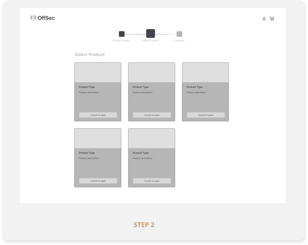
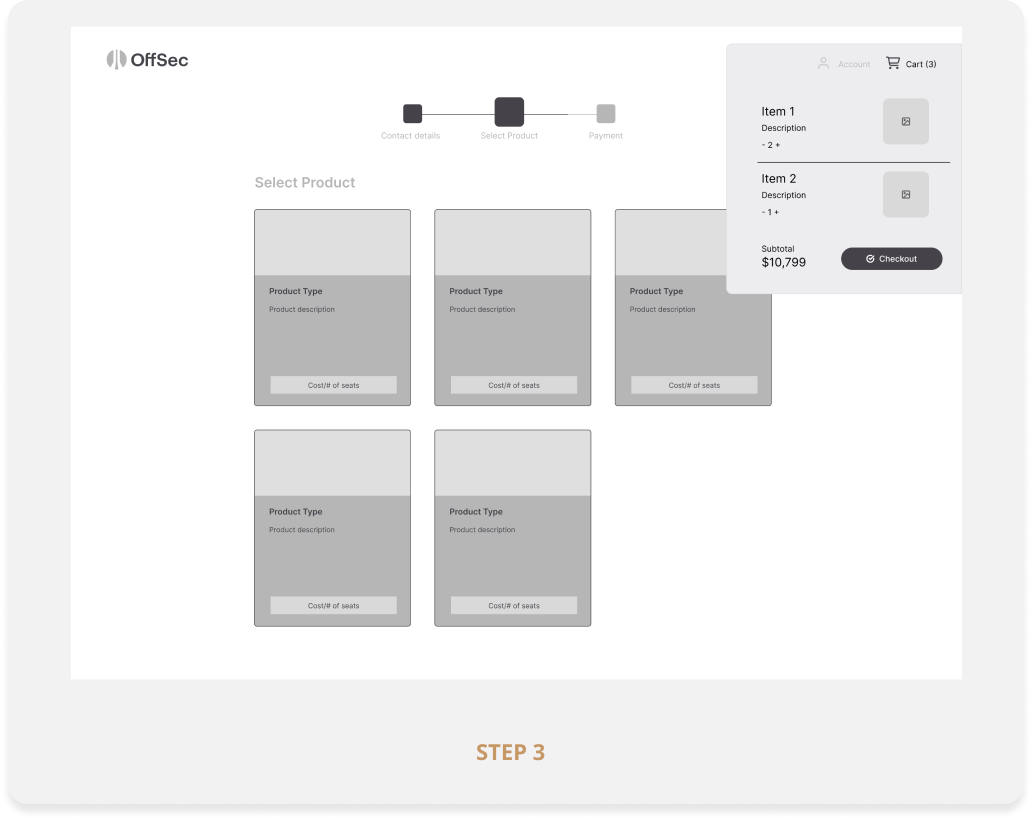
I led UI/UX design for the checkout redesign, collaborating with the CEO, CMO, eCommerce Manager, and Product Director to create a more unified, brand consistent purchasing experience that reduced friction, built buyer confidence, and carried the visual language of the new site all the way through to conversion.
THE TAKEAWAY
The redesigned checkout flow delivered a measurable lift in purchasing performance. Conversion rates improved by 18%, average order completion time dropped by 24%, and cart abandonment decreased by 22%. The project was a strong reminder that brand equity can only mask UX debt for only so long. Investing in the experience, not just the product, was able to turn a functional flow into a competitive advantage.
THE WORK